Today the ABS released its monthly Labour Force figures.
The headline figures were for the seasonally adjusted unemployment rate to remain steady at 5.4%, and the trend rate to rise from 5.3% to 5.4%
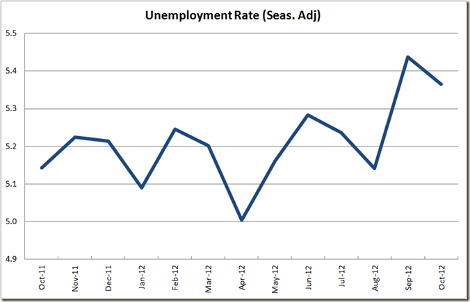
If we want to break it down to a few more decimal places (in which doing so also reduces the confidence with which the ABS is sure they’re accurate – but what the hell), then the seasonally adjusted rate fell from 5.4377156% to 5.3645712% or a fall of 0.07314 percentage points. So it was very close to being a fall to 5.3% and it is why the ABS actually says the rate fell by 0.1 percentage point even though there was no change in the actual rate when rounded to 1 decimal point.
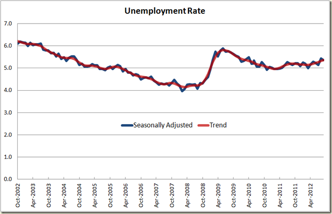
OK let’s look at the graphs:
Pretty flat with a slight uptick. Looking closer over the past 12 months we see this more clearly:
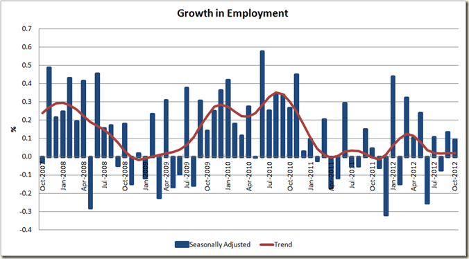
The main reason unemployment fell (or remained steady) was because employment actually grew by 10,700 jobs (around 0.1%) and participation fell by about the same.
As you can see the past 2 years has been very patchy compeered to the good growth in later 2009 and 2010 as we came out of the GFC:
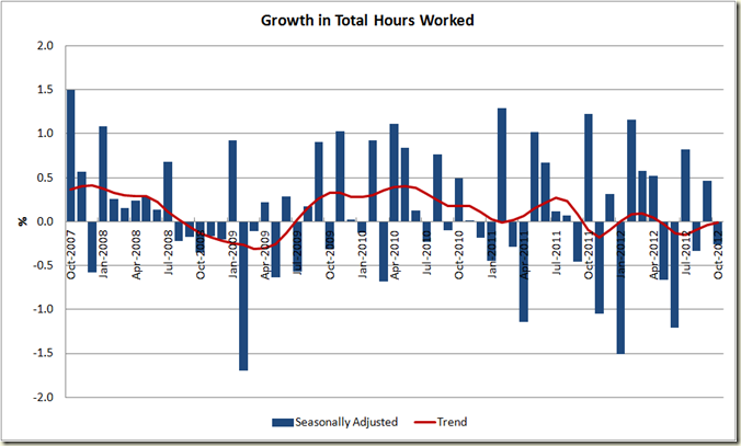
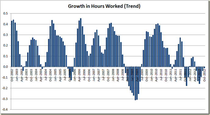
While growth in employment numbers is good, number of hours worked fell, which is not good:
If we look at this in trend terms you can see that as with total employment numbers, the past 2 years has been weak compared to 2009-2010 – let alone that nice pre-GFC period of 2006-mid 2008.
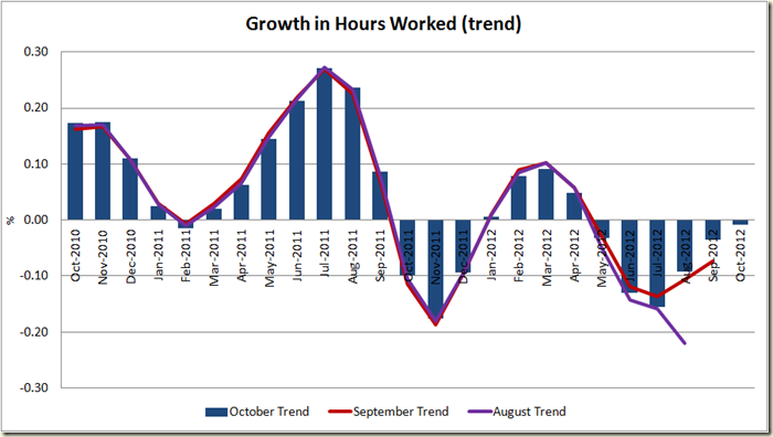
But the picture isn’t as bad as it looked to be a couple months ago. The below chart shows the changes in trend hours worked over the past 3 months. Back in August things looked to be going downwards, and this month now shows even better growth (or less decline to be exact) last month than was believed to have occurred last month.
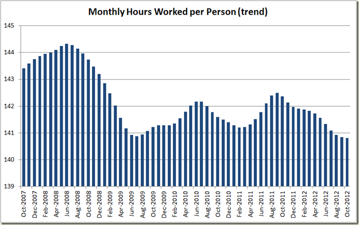
But it all points to less hours being worked per person than we worked during the GFC. In fact it’s currently at record lows (though that is because there is more part-time work than there ever was in previously worse recessions such as in the 1990 and 1982 etc)
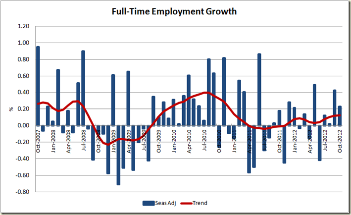
In some good news, full-time employment did increase this month – though it’s still weak
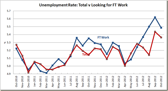
This increase in work led to a decrease the unemployment rate for those looking for full-time work
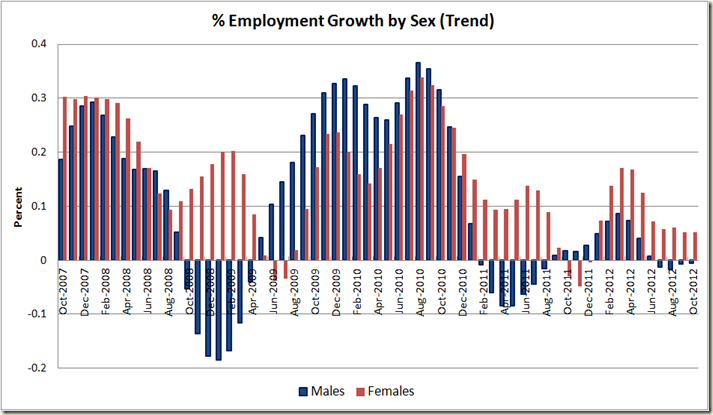
Once again the growth in employment is coming from women, not from men:
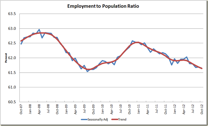
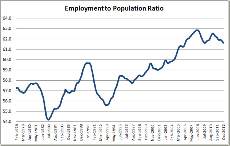
Now to my always favourite metric of the employment to population ratio we see a decline of 0.1 in trend terms and a steadiness at 61.7% in seasonally adjusted terms.
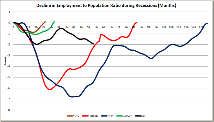
Which when compared to other recessions, shows the impact of our changing demographics and ageing population. Despite Australia not suffering from a recession at all, let alone one as severe as the 1981-82 recession, the impact on the labour force is now almost the same.
I seriously doubt we’ll ever return to the pre-GFC highs. We have lost too many older workers who are not being replaced”
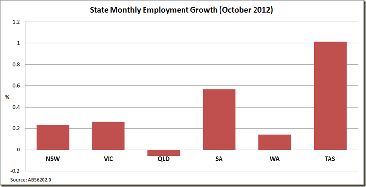
Now onto the states, and we asks ourselves where would we like to not be living right now:
Yep, Queensland was the only state to have a decline in employment in seasonally adjusted terms. Well done Campbell Newman a real bang up job you’re doing there.
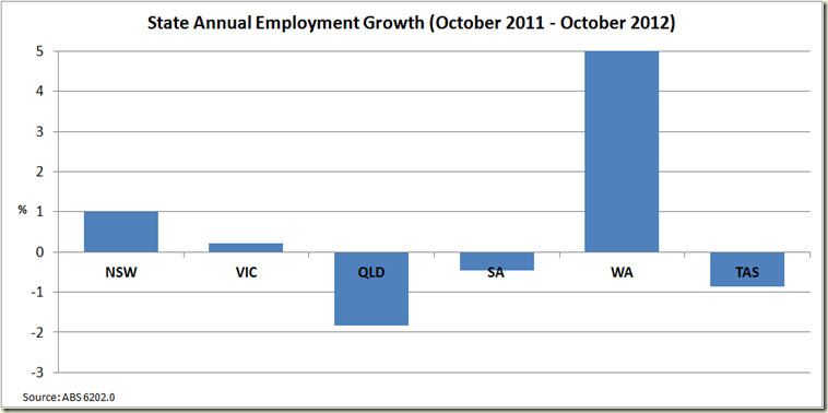
But maybe October was a glitch. Let’;s look at the past 12 months:
Queensland: The new Rust Belt State
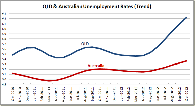
How does this all play out in unemployment rate terms?
Not pretty. But such are the “benefits” of austerity.
***
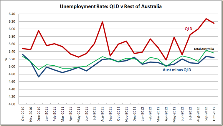
On Twitter a few people asked me what is QLD’s unemployment rate compared to the rest of Australia – ie not including QLD.
A look at the unemployment rate shows that QLD has increased to the point where only Tasmania is above it. WA is down at 4.6%, NSW is on 5.2% (ie below the national average) and Victoria in on 5.4 (right on the average) and SA is on 5.6% (just above the national average).
To look at the rest of Australia I excluded the ACT and NT because the ABS doesn’t give their unemployment rate out in seasonally adjusted terms – only in Trend. Given their small populations I doubt it would change much anyway, and given the ACT’s unemployment trend rate is 4.1% and the NT’s is 4.5% it would actually make thing look worse for Queensland than they do.
Without Queensland the unemployment rate would be 5.24%. Back in Jun the Rest of Oz rate was 5.21% and QLD was 5.32%. Since then the Rest of Aus rate has increased by .03 percentage points, whereas QLD’s has increased 0.84 percentage points.
Or as Possum would say, “They’ve been Newmanned”.

2 comments:
Two points:
a) Adding more decimal places doesn't add any extra information as the standard error is just too large. You'll find the standard error in the percentage is of the order of 0.1-0.2%. As is standard in every other science (except it seems the dismal one), you use one significant figure for your error and round your estimator to that order of magnitude. So 5.4% contains the useful numbers, the rest can be 99.9999% (or so) accounted for by noise.
b) Edge effects in trend estimates are boring. Everyone knows about them and why they are there.
Yes Austin that's why I noted that showing the decimal places reduces the confidence that they are accurate. Not everything has to be scientifically rigorous, sometimes you display things just because it's kind of interesting. They key is not to treat it like it is on a level with the data that has greater rigor (which I don't.)
And actually I find the trend edge effects interesting.
Post a Comment